- © 2025 Annapolis Home Magazine
- All Rights Reserved
By Dylan Roche
In this section, we present four distinct kitchens that reveal an array of recent designs. – AH
Photography by Stacy Zarin Goldberg
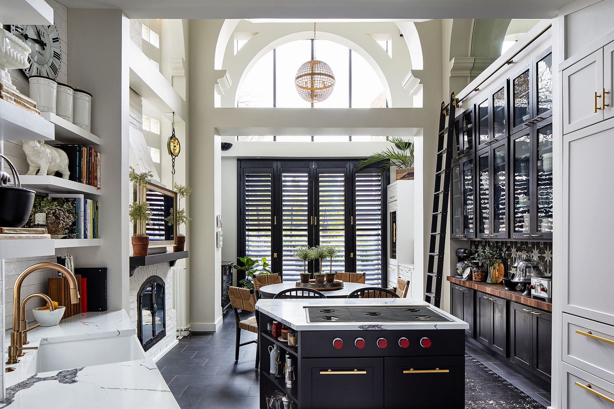
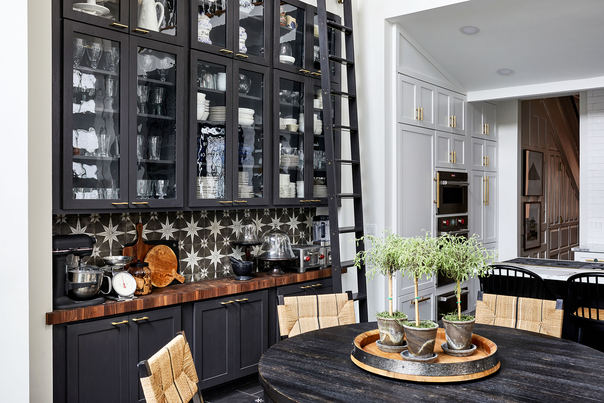
John Audet believes that a black-and-white theme for a kitchen is underrated. This kitchen he recently designed is a “perfect example of how a black and white kitchen can be elegant, sleek, and traditional all at one time,” says Audet. Thanks to the way he worked within the existing Art Deco architectural features of the original home and his use of many bold details, the result is a kitchen that could hardly be described as predictable.
The biggest challenge the kitchen posed was its unusual shape and size. Somewhat small for a kitchen that was expected to have all the amenities, the angled walls cut into the practical space even more. Much of Audet’s redesign focused on making the kitchen more practical by rearranging elements, such as centering the sink under the window and placing the fridge close to the main workspace. He also added a coffee and wine bar and managed to nearly double the storage space. To maximize openings and storage space in a smaller layout, Audet used frameless cabinetry.
A standout element of the design is the tilework. The main backsplash uses classic subway tile at a slightly larger size than standard (3″x 12″ versus 3″x 6″). Its slightly wavy surface reflects light at different angles—a feature which, Audet points out, adds interest to a somewhat vast surface. The secondary backsplash behind the dry bar area is an 8″x 8″ cement-looking porcelain called Compass Star that brings boldness to the kitchen, especially when paired with the black cabinets and solid wood custom countertop. A library ladder up against these cabinets adds the perfect element of interest.
Audet explains that another practical but aesthetic material in the kitchen is the quartz countertops. Quartz has the appearance of marble but holds up better to use. Similarly, the Wolf and Sub-Zero appliances are the right size to be functional, but as panel-ready models, they look like cabinetry, thus avoiding the appearance of a wall of appliances.
Finally, this is a kitchen where it’s worth glancing down at the floor. Dark wood flooring isn’t a common choice for most homeowners, but it is something these homeowners love, and Audet agrees it works well for the space.
Kitchen Design: John Audet/Melissa Wood, Case Architects and Remodelers, Washington, D.C.
Appliances: Wolf/Sub-Zero | Cabinetry: Crystal Cabinets | Flooring: Porcelain tile 12″x24″ in graphite color supplied by Mosaic Tile Co.
Photography by Lee Kriel
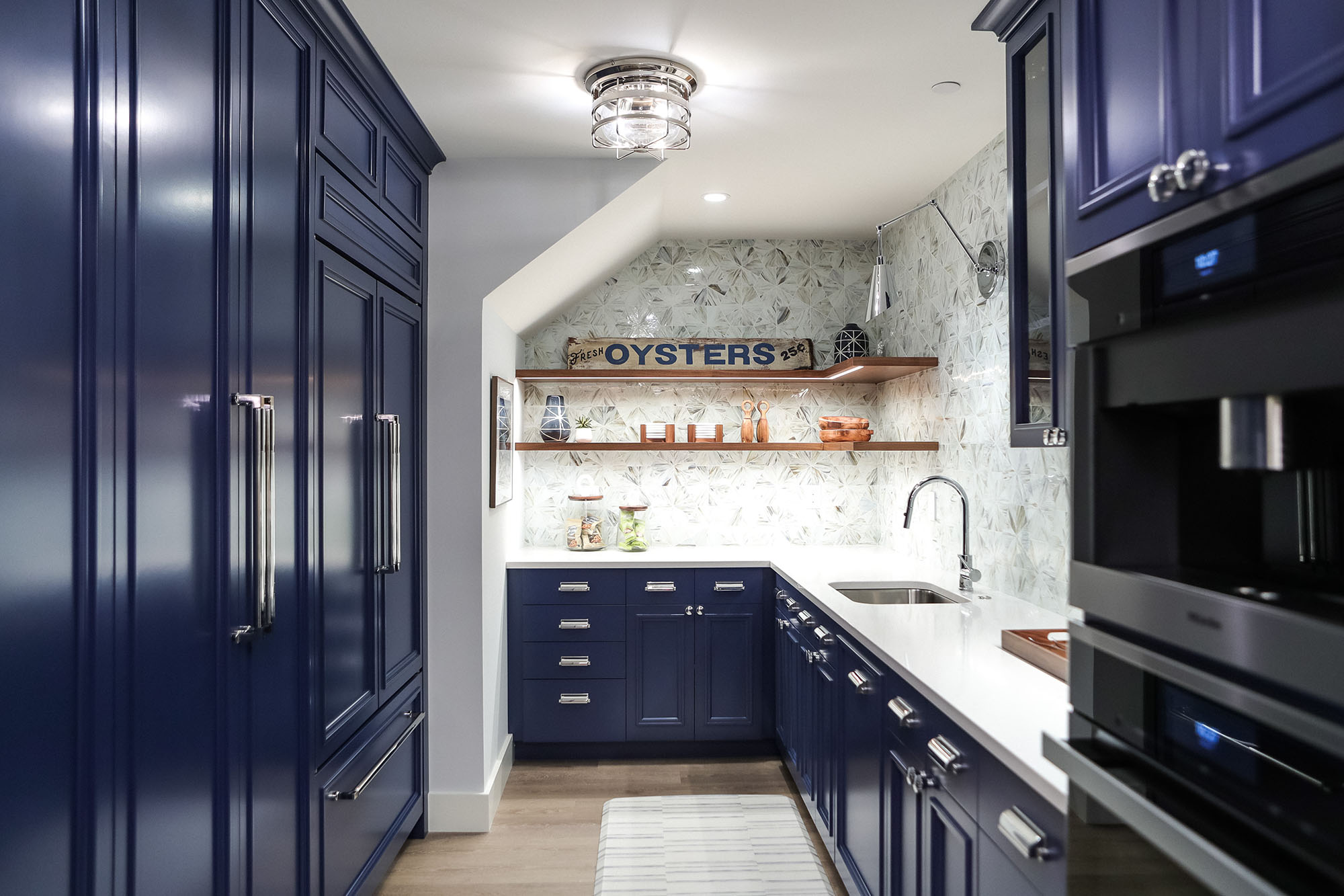
Interior designer Erin Olexia proves that not every kitchen needs to be fully equipped for it to be both beautiful and practical. After working with clients on the main portion of their home, she returned to help with the lower level, where they were turning their basement into a mixed movie theater, recreational space, and guest suite. Adding a miniature kitchen for serving snacks when entertaining or relaxing so they would not have to go back upstairs to the main kitchen helped to finish the space.
Because this kitchen wouldn’t need to be equipped for cooking a full meal, Olexia worked on a much smaller scale with a long galley layout. Designed without a stove or an oven, the focus was on storage space with a pantry area and open cabinets. The fanciest appliance in the kitchen, Olexia points out, is the high-end coffeemaker.
For the room’s design aesthetic, Olexia thought of lifeguard houses commonly seen along the beach at the seashore. She used a surfboard and coastal art to give it what she describes as a “fun, surf-y kind of feel.” Most of the walls are white, but the striking, intense blue on the cabinets was inspired by agate stone on the back wall of the basement’s movie theater. Woodwork, chrome finishes, and classic brass hardware elevate the finished look to one that is sophisticated as well as fun.
Kitchen & Interior Design: ERIN OLEXIA, Olexia Interiors, Annapolis, Maryland. | Architect: Hammond Wilson Architects, Annapolis, Maryland. | Builder: Pyramid Builders, Annapolis. Maryland.
Appliances: Miele | Cabinets: ICD Architectural Woodwork | Cabinet Paint Color: Benjamin Moore #C-5419 Enchanted Night | Cabinet Hardware: Classic Brass, Après Series | Backsplash Tile: AKDO-Aster Calico | Countertop: In Home Stone | Faucet: Signature Hardware | Lighting: Visual Comfort-Crosby Flush (ceiling), Currey & Co Lighting (wall mount) | Luxury Vinyl Plank Flooring: Elite Hardware Flooring
Photography by Andrea Wheeler
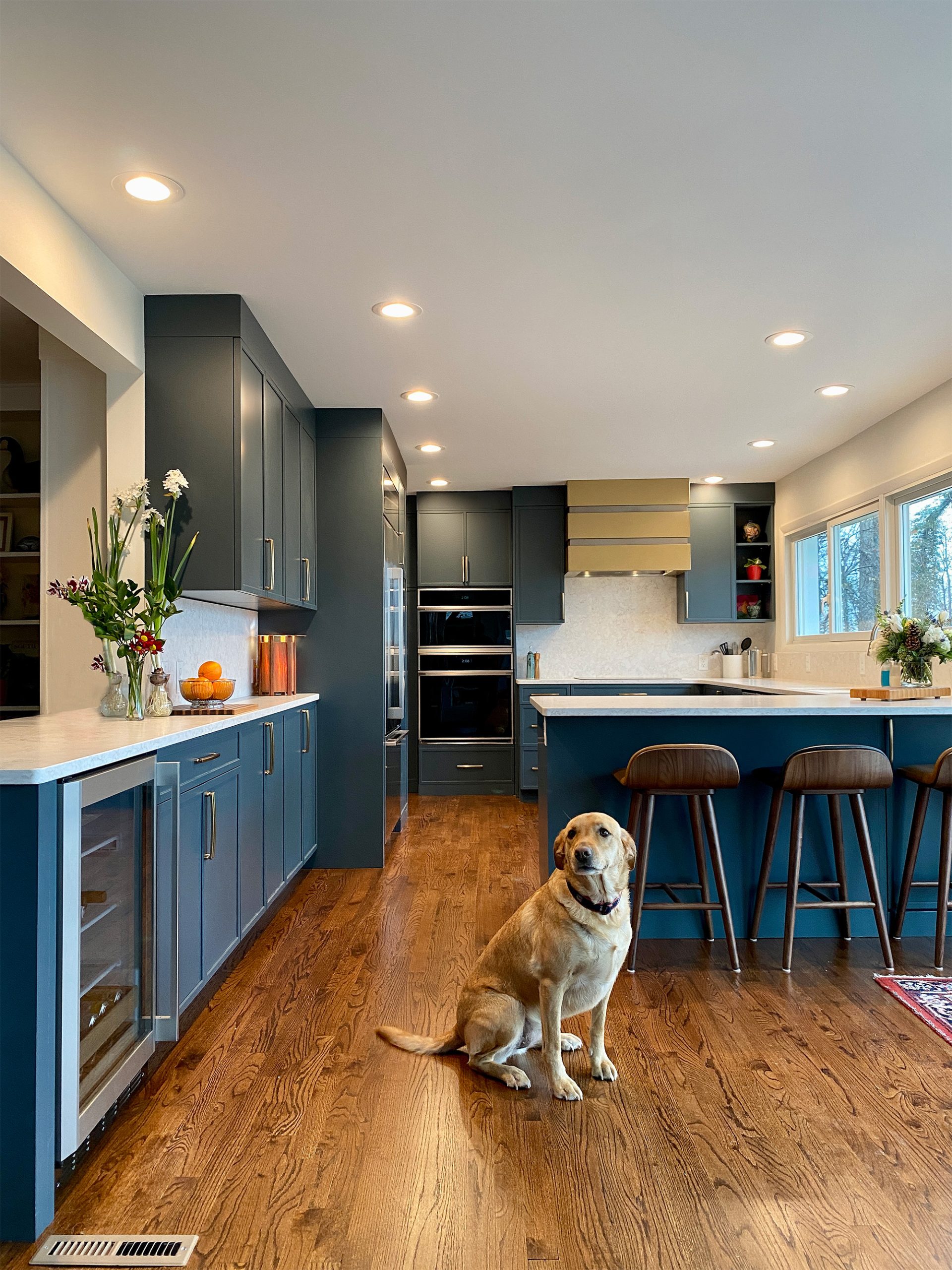
Joni Zimmerman knew her objective with this kitchen: open it up and unify it with the rest of the house. The original kitchen was closed off to the living room and dining room. Plus, its all-white coloring departed from the rest of the home’s midcentury modern brick style. That said, the kitchen’s U-shape had promise, notes Zimmerman.
But getting from “before” to “after” called for a smart reorganization of the layout. Basically, everything was switched around. She removed bookcases from the living room to create a pass-through (though the post stayed for structural reasons). She added a sliding glass door for egress and a better view from the living room. Closets were removed and replaced with cabinets, creating a jog on the wall where the cooking equipment was installed to add an element of interest. A large flank of windows installed in the wall now offers a water view to bring in some scenery.
One design choice Zimmerman had to make for the cabinetry was whether to go with a dark woodgrain, which would be true to the midcentury modern style, or go a little bit more daring with modern undertones. Opting for the second choice, Zimmerman chose spruce cabinets that pair well with the tones of the brickwork and the wood floor. Neither too blue nor too green in its coloring, the spruce even works well with the dining room furniture and complements the view of the outdoors through the extensive windows. The countertops and full splash light ensure the kitchen does not get too dark, Zimmerman adds. But the focal point of the kitchen? Look no further than the statement hood, which Zimmerman describes as “the jewelry in this well-dressed kitchen.”
Kitchen Design: Joni Zimmerman, Design Solutions Inc., Annapolis, Maryland
Appliances: Monogram supplied by Bray & Scarff | Countertops: Classic Granite and Marble | Cabinetry: Signature Custom Cabinetry
Photography by Steve Buchanan
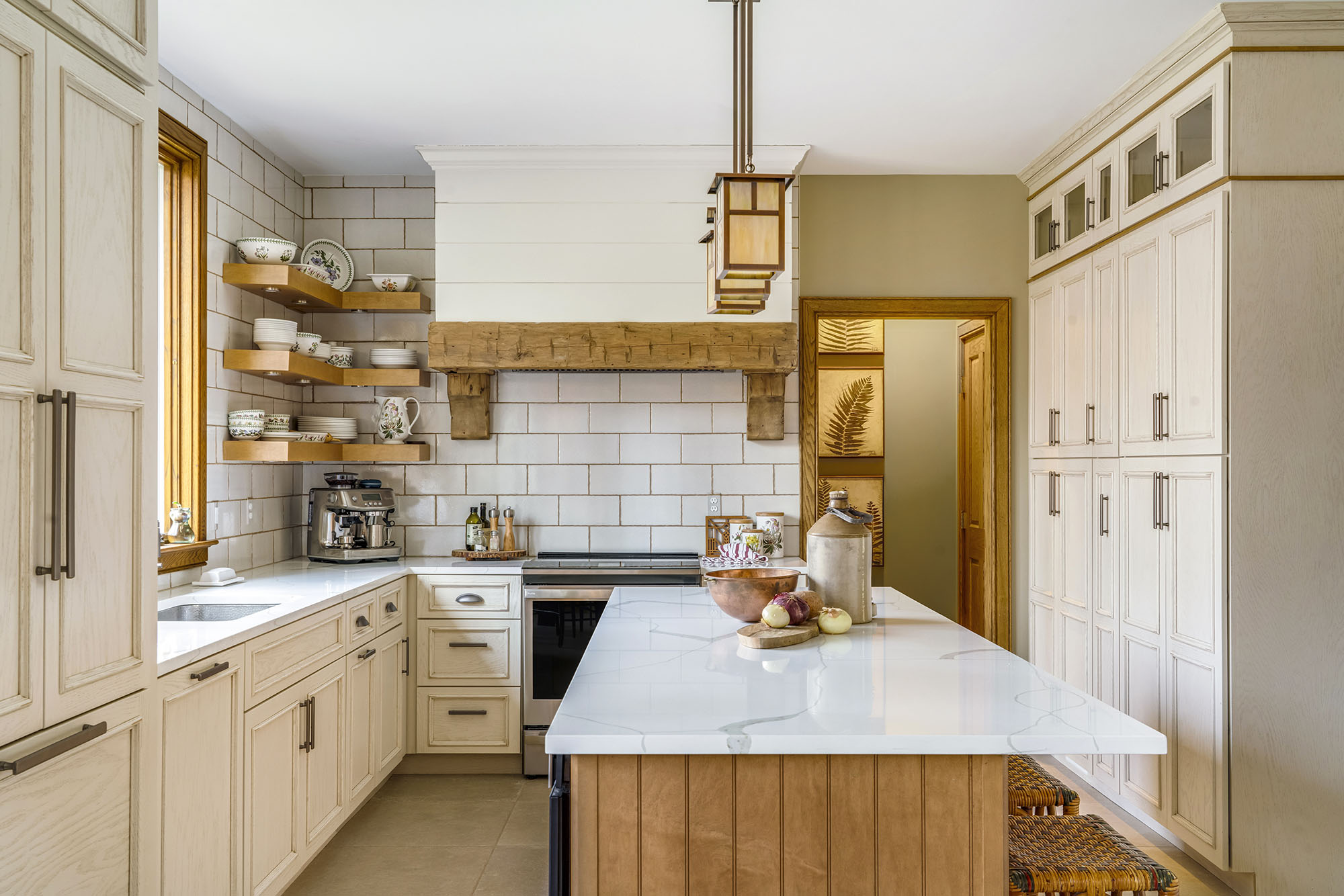
When Gina Fitzsimmons began working with her clients on this kitchen design, she knew they felt safe and comfortable with the mission style that carries through most of the house. But she knew if she could get them to stretch a bit out of their comfort zone and experience a new way of looking at things, the results could be spectacular. Fortunately, she was able to convince them, and she worked in farmhouse elements that complement the mission style already in place with the house’s architecture.
She knew the space needed more light, so she added a much larger window over the sink to bring in some sunshine. She upgraded the dark wood to a creamy off-white color that still retains touches of the wood the owners love so much.
The cabinets are oak with a caramel stain, which was covered with cream paint and then sanded to reveal glimpses of the caramel underneath, Fitzsimmons explains. Antique beams add more wood to the design, along with the honey-brown oak around the island. Another element that makes this redesigned kitchen feel open and airier than before is the tilework that goes all the way up to the ceiling, drawing the eyes upward and creating an expansive look. The ceramic tile is slightly larger than normal subway tile and has a faint speckle to it that enhances its creamy color, notes Fitzsimmons. For a little bit of contrast, the ceramic tiles on the floor have more of a limestone feel.
She elevated the kitchen’s look by installing a built-in fridge with paneled doors to disguise it, along with an enlarged cooking hearth to serve as the kitchen’s focal point. Floating shelves allow for the display of beautiful dishware, doubling as storage and décor. The overall effect of the kitchen is comfortable—one that maintains the beauty of the wood the clients love so much without ever feeling dark and cramped.
Kitchen Design: Gina Fitzsimmons, ASID, Fitzsimmons Design Associates, Annapolis, Maryland | Builder: Hammersmith, Inc., Annapolis, Maryland
Appliances: GE Stove Radiant, Dacor Counter Depth Refrigerator, Uline Under Counter Refrigerator | Tile & Stone: Compass Stone & Tile Studio | Flooring: Oak and Ceramic Travertine | Cabinetry: Fieldstone Cabinetry (installed by Hammersmith)
© Annapolis Home Magazine
Vol. 15, No. 1 2024