- © 2025 Annapolis Home Magazine
- All Rights Reserved

The term “Tidewater Manor” is often tossed around, but how are authentic ones defined? Architect Anthony “Ankie” Barnes certainly knows: he built a historically accurate manor from the ground up for Pam and Bill Girtman, who were delighted to find Barnes of BarnesVanze Architects in Georgetown.
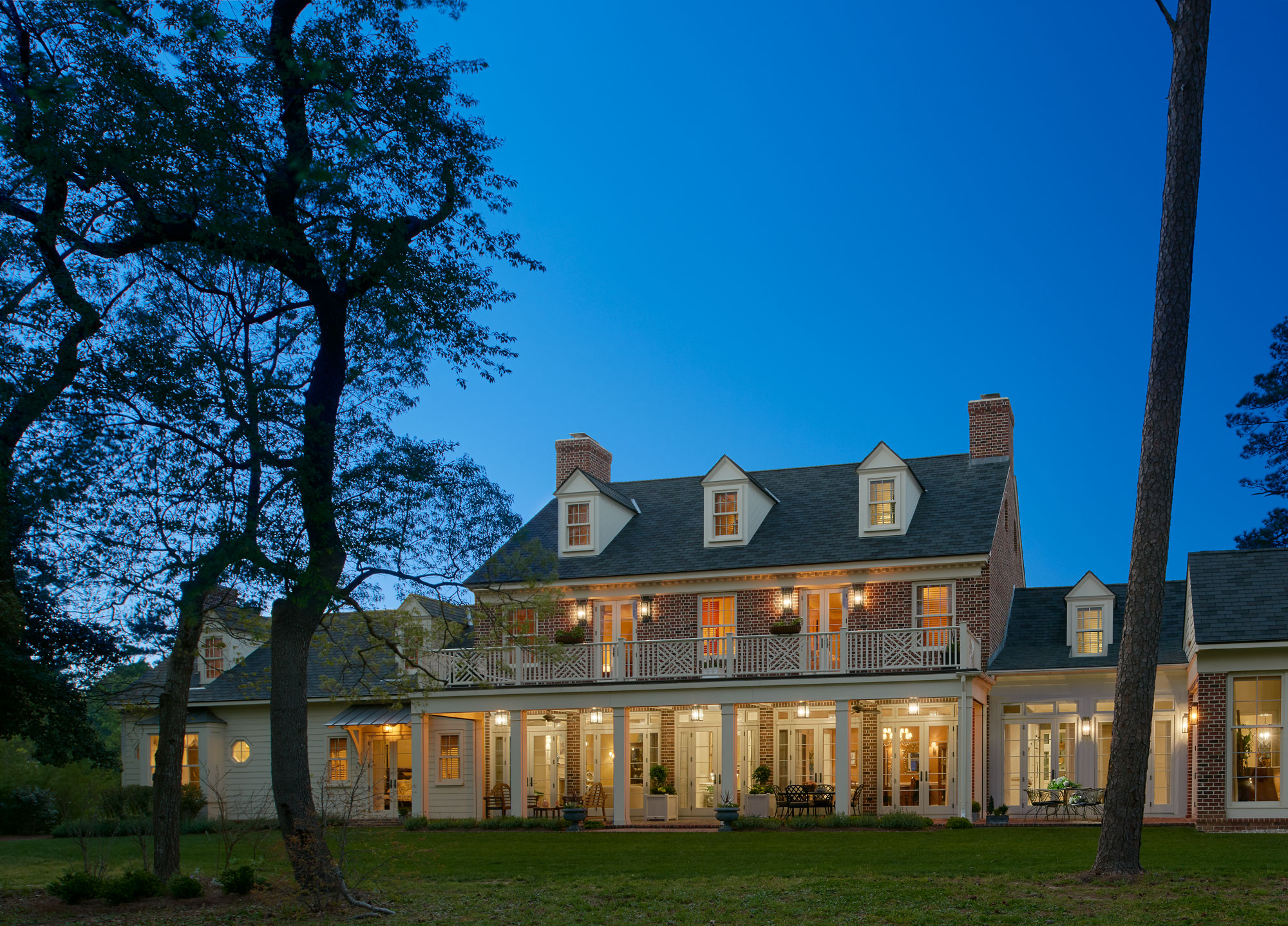
“The layout is symmetrical, inspired by the English roots of the settlers in this part of Virginia. The center portion is brick, which would have come to this area as ballast in ships from England,” Barnes explains, “and the ‘wings’ either side are clapboard and would have been added as the wealth of the owners increased.”
The loggia, a common architectural element of a Tidewater home, faces the water, and French doors open out from several rooms on the main floor of the home for entertaining and dining.
After living abroad for decades and purchasing a waterfront property, the Girtmans needed someone who understood their vision for “a home that was historically accurate on the outside, but up to date on the inside,” says Pam.
“When I saw the property, I knew the house should be nestled amid the trees so it looked like it had been there forever,” says Barnes.
On his first visit, Ankie established where the center of the house should be and personally tied a marker in a tree so the builder would not miss it. Within a few days, Pam explains, he sent us hand-drawn plans of his vision of the house situated on the land as if it had been there for generations and the development had grown up around it.
Since the Chesapeake is a working waterfront, the house is oriented toward the water to take advantage of the prevailing winds, which “tends to dissuade bugs, and offers deliberate water views from almost every room in the house,” says Barnes.
When it came time to focus on the interior design, Pam called DC-based interior designer Barry Dixon who is internationally known for his understanding of period architecture and furnishings. He offered strategies for incorporating the Girtmans’ eclectic collection of art, furniture, and decorative pieces garnered from their extensive international travels. “We selected fabrics, paint, and furnishings to tie into the Tidewater style, and that would blend with what Pam already had, to create a cohesive look throughout,” Dixon says.
Dixon also developed the space plans and chose paint colors from his C2 paint line. “The tidewater is a working waterfront area, so it is entirely appropriate for these colors to be part of the design,” he says. Dixon helped select materials like the pecky cypress beams in the sunroom. “Cypress grows in the water,” he adds by way of explanation. The distinctive color and texture contrast in the cypress is caused by a fungus that produces ‘pocket rot’ in the living trees. The resulting visual texture is stunning, and just what this room needed, notes Dixon.
Historically and currently, kitchens are the hub of activity in a household. “This kitchen is large but not huge. The island seating adds ‘glass-of-wine’ company opportunities while keeping them out of the way of the chef who has a direct line of sight to the water at all times,” says Barnes.
The main focus of the master bath design was beauty and a spa-like feeling, with soothing colors and a focus toward the water. “The symmetry, materials, and tub framed by the water view achieve these goals, and a subtle but quietly-ornate marble tile was used throughout for its understated luxury,” says Barnes.
“The architect and decorator helped us bring in elements of the outside by using wood milled on site from 90-year-old pine trees that were faux-finished and used in paneling in several rooms. Pecky cypress was faux-finished to blend with the trees outside the family room,” Pam says. “Although we lost wall space with all the windows, we are still able to display items that have special meaning or reflect where we have been fortunate to have lived and traveled.”
Not surprisingly, the landscape plan reflects the style of the house and pays homage to its setting. “There were black cherry trees, some beautifully distorted by the wind, all over the lot, so some we left attempting a native, wild feel on the waterfront,” says Ann Stokes of Landscape Architects. “But [the landscape] gets tighter toward the house and looser away from it,” she adds.
The walled cutting garden draws on historical patterns common to the Eastern Shore. “Some of the plantings are native to this area, others are not, and the wall keeps out the deer. We tried for a simple and elegant yard that respects the tidewater landscape,” she adds.
According to Pam, the process had the best possible outcome. “It all led to two professionals who worked their magic shaping a notebook of ideas into reality as a home.”
ARCHITECTURE: Ankie Barnes, Michelle Vassallo, and Camilo Moreno-Hines, BarnesVanze Architects, Inc., barnesvanze.com, Washington D.C. | BUILDER: Luke Kellam, L.J. Kellam Construction LLC, kellamconstruction.com, Belle Haven, Virginia | INTERIOR DESIGN: Barry Dixon, Inc., barrydixon.com, Warrenton, Virginia; Lise Fitzpatrick Interiors | LANDSCAPE ARCHITECTURE: Ann Stokes, Ann P. Stokes Landscape Architects, apsla.net, Norfolk, Virginia | LANDSCAPE INSTALLATION: Jeff Klingel Landscape Design, jeffklingel.com, Eastville, Virginia | STRUCTURAL ENGINEER: Chris Cobb, Robert Silman Associates, silman.com, Washington D.C.
Annapolis Home Magazine
Vol. 12, No. 2 2021