- © 2025 Annapolis Home Magazine
- All Rights Reserved
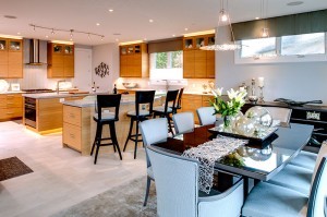 For most of us, the kitchen is the beating heart of the home, the place were food is cooked and eaten, where kids do their homework, where family rushes in and out and guests linger to talk and drink and sample what you’re making. Given the chance to remodel our kitchens, we’d long for the pristine countertops and gleaming appliances, but we also want all the little things that make working in the kitchen easier. Mark White, of Kitchen Encounters in Annapolis, sums it up, “It doesn’t matter how beautiful a kitchen is, it’s flawed if it doesn’t flow and function.”
When Trina and Rick Mostyn approached Kitchen Encounters for help with their new kitchen, White applied his mantra: function first. Designers are often limited by construction elements but because the homeowners were remodeling their entire house, including changing walls and adding a new roof structure, White had an excellent opportunity. He worked closely with interior designer Pat Cundiff who selected finishes, countertops, tile floors, and other final touches. White focused on developing a truly functional layout that met the clients’ needs, working out the details of space planning and cabinetry, storage options, and integrating the appliances.
White’s first step is always to start with an idea of what a client likes in terms of style and environment. The homeowners wanted very contemporary styling and had fallen in love with the horizontal grain bamboo cabinets on display in the Kitchen Encounters showroom, so that was one early and important decision made easily. Everything else came together during the design process.
White next explored a variety of footprints for the kitchen, creating different functional layouts for each workspace. Even at this early stage, he incorporates aesthetic elements such as cabinetry and focal points, to create a balance of symmetry and asymmetry. As the designs progressed, White altered from the architect’s original plans some walls and entries, including the entry from the garage and mudroom area for better flow into the kitchen. White, Cundiff, and the homeowners looked at many options and pieced together elements from several concept sketches, what White calls an “interactive design process.”
 The final kitchen design has a unique, contemporary style. Instead of a single large island, White devised two islands with independent work zones that nevertheless work together as a whole. A single large island in such a great amount of space would have created an obstacle, a barrier to an efficient flow through the kitchen. With two islands, much activity can take place in a small area. “An easy mistake with a large kitchen,” White notes, “is to spread everything out so much that you need roller skates to get around in it.”
The kitchen’s tall ceiling prompted White to create a stacked effect with the cabinets. In the uppermost cabinets, which are hardest to reach, he used glass fronts to form a display case for special heirlooms and tableware. The lighting in the kitchen is a masterpiece in itself. Some of the cabinets have interior lighting. There is track lighting above one island, recessed ceiling accent lights, under-cabinet and task lights, and toe-kick lighting for a soft glow along the floor, all carefully planned for maximum effectiveness as well as beauty.
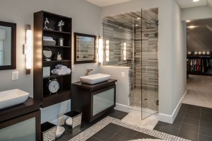
Kitchen Encounters also contributed to the master bathroom design. Crediting Cundiff for the contemporary design desired by the homeowners, Kitchen Encounters made two cabinets for two vessel sinks with individual mirrors above each. The cabinets below the sinks have frosted glass doors and contain deep drawers for storage, modified to wrap around the plumbing. There are no drawer pulls; the top of each drawer is beveled for a finger grip. In addition, a wall-hung cabinet holds towels and items for display. The tile work was done under Cundiff’s guidance, as was the placement of the freestanding tub under the window. A large walk-in closet wraps around the bathroom and opens into the master bedroom. It has barn-style doors on tracks that either roll to close both the entry into the bathroom and the entry into the bedroom or overlap to leave both entries open, again displaying a neat application of flow and function without sacrificing aesthetics.
Imagine a seagull gliding high above the Bay. 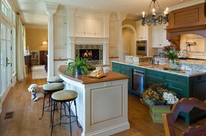 Next, picture a baby osprey crash landing on Spa Creek. Good and bad kitchen design has much in common with flying: success depends upon balance. When balance is achieved, there is harmony. When there are flaws, there is disruption, lack of ease, or even pain if you hit your head on a cabinet door while loading the dishwasher. By contrast, a good design promotes effortlessness and comfort. Every phenomenal kitchen has this balance, a special poise, and a primary example can be found in the work of architect Leo Wilson of Hammond Wilson Architects in Annapolis and kitchen designer Brad Creer of Bradford Design in Bethesda. Recently, an Annapolis couple turned to Wilson and Creer for help transforming their newly purchased 1970s waterfront house into a home, but not just any home—one with seven working fireplaces, including one blazing away in the kitchen.
Wilson and his firm aggressively redesigned the house, built by Greg Younger of the Annapolis-based Younger Construction Company. Wilson added fireplaces, moved walls, and enlarged the kitchen, which needed thirteen appliances integrated seamlessly. The kitchen is, literally, in the home’s center, so creating some privacy, while including a fireplace, sitting areas, a suite of professional-grade appliances, and workstations were especially tricky, says Wilson.
Early in the design process, Wilson and Creer collaborated to create a balance not only between appliances and furnishings but also between space and matter, forming, among other things, invisible pathways so one can travel easily from island to island, from task to task, appliance to appliance. Wilson believes the kitchen’s success has much to do with deferring to a professional kitchen designer. “They know about options you may never have heard about. They’ve done this before. They know your story even better than you do,” he says.
Creer had many conversations with the homeowners and came to understand their romance with warm fires, and respect for beauty—they wanted both in a truly working kitchen. “To make a kitchen functional is fairly easy but to make one beautiful and efficient is harder,” he explains. For instance, what good is an attractive fireplace if you can’t experience it? With this in mind, Wilson and Creer positioned the fireplace higher than usual so the chef could see it while cooking. The mantel was designed by Creer to complement the kitchen cabinetry. A flat screen television overhead is hidden behind pocket doors.
Creer notes that the drama created by the fireplace and range hood is balanced by quieter elements. For example, the cabinets along the range walls vary in placement. “I like to pull some cabinets out and push others back in so it doesn’t look so clinical with them all lined up,” says Creer. He anchored the inside row of cabinetry at both ends with tall cabinets, which creates symmetry. Creer also used color to provide symmetry. “There is lots of glaze, lots of sheen, calling attention to the island, which is a unique green,” he notes. Cabinet and wood floor finishes complement and accentuate each other. “That is very important to kitchen design, there are different grains, species, colors, and intensities. All these things play and can almost clash, so you must make sure the woods are compatible,” he says. Fine but seminal details such as these could get lost in the process of designing a kitchen.
Before embarking on your own project, Wilson suggests three things. The first is to take your time and educate yourself
about the many options available and then build upon that knowledge. The second is to trust an expert. “Don’t be afraid to hire a qualified kitchen designer. The A+ kitchens all have them. It is invaluable if you want a good outcome,” he says. Finally, he cautions: “Be honest with yourself. People demand a lot from their kitchens today. They tend to be way over the top, with not just one workstation but two. Make sure you need what you build.”
When Larry and Tammy Ray decided to begi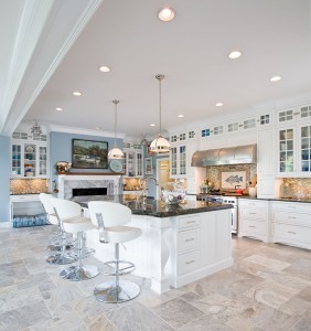 n an extensive remodel of the kitchen in their home in the historic community of Rugby Hall on the Severn River, they turned to someone they trusted, Dave Porter of Annapolis Kitchen and Bath. Porter designed the kitchen of their former home, a post-and-beam home with distressed cabinetry, custom built new in 2001. They were so happy with that kitchen that they knew they could put the Rugby Hall kitchen in no better hands.
In remodeling this older kitchen, the Rays wanted a nautical theme, combining elements of both Nantucket and Chesapeake styles. The biggest challenge was to enhance the splendid views of the Severn River, not hide them with cabinetry. Porter met the challenge with a color palette of soft gray-blues and whites. He took out an exterior wall in order to add a dining area lined with windows. A trimmed out wide beam marks where the old wall was; now the kitchen opens onto the dining area. The walls are light gray-blue and all the trim, woodwork and cabinetry are a clean white. At one end of the kitchen, the existing wood fireplace was refaced with a white mantle and pale gray marble to match the marble floor tiles. A painting of anchored sailboats hangs above the fireplace, which is flanked by glass-fronted cabinets. A backsplash of seeded glass tiles over countertops of rich blue granite, called Laborite Blue, runs through the entire kitchen.
Under the counter, on the right of the fireplace, is a bank of drawers; to the left a set of doors enclose a blue-and-white striped dog bed. Here the dog can be with the family in the kitchen, close to the action yet out from underfoot.
Farther to the right of the fireplace, on the long wall of the kitchen, is the doorway into the main hall of the house. The rest of the kitchen wall is hung with more glass-fronted cabinets. In the middle of the wall the stainless range and range hood are flanked ceiling to countertop by solid-door cabinets. Between the range and its hood, the backsplash expands to include a mosaic tile fish in the same muted grays and blues. The under cabinets are banks of drawers and doors made to look like pieces of furniture.
At the opposite end of the kitchen, the cabinets turn the corner in a combination of open shelves, drawers, and glass-fronted and solid doors, then meet the refrigerator, set in door panels made to look like a large closet with shelves above.
A large island with a blue granite countertop takes up the middle of the kitchen and contains the main sink and a stainless dishwasher. The under cabinets are again made to look like furniture, and four rather modern-styled white and steel bar chairs line up along the outside edge.
This arrangement of the kitchen allows the traffic to flow past the fireplace and around the outside of the island and into the dining and living areas, leaving the main work space protected and yet still very much a part of all the activities. Placement of the island sink directly across from the range makes food preparation and cooking convenient. There’s plenty of counter space and storage available, and the 42-inch refrigerator is just a few steps away.
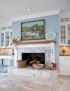
To the right of the refrigerator a door leads into a living area painted a darker shade of blue, with white trim and hardwood flooring, and lined with large windows looking out over the Severn River.
Next to the door is a large wet bar and entertainment center, created out of the same cabinets as the kitchen but stained a rich brown. The back of the wet bar has been cut out and left open to the living area to frame the view of the Severn. The wet bar has its own sink, along with a wine fridge, a dish drawer (a small dishwasher in a drawer), and a small refrigerator. The bar countertop is a light brown mottled granite that, along with the brown cabinetry, picks up the browns and yellows in the backsplash, fish mosaic, and floors. Duane Dwyer, owner of Annapolis Kitchen and Bath, notes, “When you’ve got an entertainment area set up like this, with a fully-functioning wet bar, plus the small fridge and the dish drawer, and that is still close to the main refrigerator, it makes it truly convenient to serve guests without disrupting the work in the kitchen.”
The wet bar, with its cut-out back framing the river view for the kitchen, is strategically placed where the kitchen, dining area, and two living areas meet. Traffic, conversation, and food and drink flow freely into all the areas and leave the kitchen work area free.
The touch that completes the kitchen is the lighting. Recessed lights shine down from the ceiling and under cabinet lights brighten the task areas. Two stainless, nautically styled fixtures flank the fireplace and two opaque glass and stainless steel lights hang over the island. Plenty of natural light floods in from the dining area’s tall windows crowned with almost Palladian curves and through the wet bar, bringing cheer and warmth into the kitchen.
Porter’s selection of country-style cabinetry, stone counters, and floors combine with the modern appliances, lights, and furniture, and with the fresh blues and whites, to bring the Rays’ nautically themed kitchen to life.
 Tucked away down at the waterfront end of one of Eastport’s narrow residential streets is a brand new house which, on the outside, looks like the late 19th- and early 20th-century family homes for which Eastport is known. Inside, however, you find things are different. Large glass windows and doors stretch floor to ceiling along the entire waterfront side of the house, framing an absolutely glorious view of Spa Creek from the drawbridge to Acton Cove.
Local builder Patrick Mona acquired the lot to build a vacation home for his mother, an acclaimed artist who lives in Connecticut. He chose local architect Scott Rand to design the house to take advantage of every square foot and maximize the spectacular view. Mona notes, “Scott had been involved with the lot for about 15 years and had basically already built the house in his head. He had the concept of the panoramic setting. Openness was very important to the overall design.” Mona’s mother also had considerable input in the design, and Rand’s open concept fit well with her desire to have the home be a backdrop for her own artwork and selected pieces from her extensive art collection.
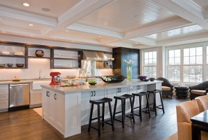
The panoramic concept for the house has been successfully carried into the cooking and dining area. Your first impression is of clean lines, white ceiling and walls and dark flooring, a modern, almost Spartan look that somehow doesn’t feel cold. On second look, you can see why. The only highly reflective surfaces are the glass windows. What could be stark and icy is instead softly glowing as if with the gentle patina of age. The ceiling is coffered, with each section filled with recessed lights. No chandeliers or hanging lights dangle from the coffers and no standing lights reach up from the floors to interfere with the view. Ceiling and walls are painted a soft white and the hardwood floors are stained a deep walnut, coated with old-fashioned paste wax rubbed to a soft polish that modern epoxys and poly coatings can’t match.
The kitchen runs along the western wall of the house, which is lined with open, thick wood shelving matching the deep walnut of the floors. Mona comments, “This open shelving is an unusual concept for the Annapolis area, where you generally have the traditional cabinets and doors.” A long counter, with sink, range, and oven in the middle, runs under the open shelves and over a bank of drawers and cabinets painted light gray with black hardware that lend an old-fashioned touch to the modern openness all around.
 In front of the long counter is a large island with more drawers and cabinets matching the wall cabinets and a stainless dishwasher facing the sink and stove. Along the outer edge are black stools with seats curved just enough to comfortably fit guests. All the countertops are constructed of thick concrete, tinted a pale gray with a subtle swirl pattern and polished to a silky sensuousness that makes you long to spill crumbs on it so you can brush them off. Mona’s mother has concrete countertops in her current house in Connecticut and insisted on them for her new kitchen. Mona notes, “Concrete countertops are another element unusual for this area, but they’re beginning to catch on. You can do all sorts of amazing things with concrete.”
The kitchen’s position at the west end of the house allows it to look out over the entire open living space and take in the whole panoramic view of the waterfront. The dining area just beyond the island is defined by the long, plainly styled, dark wooden dining table, surrounded by chairs in a simple modern cube style, upholstered in pale gold fabric.
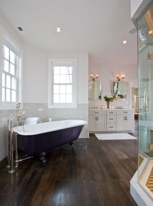
The combination of openness, simplicity, and sensuousness repeats in the master bath upstairs. The walnut-stained hardwood floors continue throughout the house, instead of tile in the kitchen and bathrooms. The master bath opens off the bedroom in an angular S-shape. The room widens to accommodate a reproduction claw-foot tub under another large window looking out at Spa Creek. Opposite the tub is a commodious glass-walled shower, designed by Maryland Shower Enclosures, lined with narrow white, gray, and black tiles. Even bathing provides a fine water view. A huge walk-in closet lies just beyond and has its own window with a view.
From Annapolis Home Magazine
Vol. 4, No. 1 2013