- © 2026 Annapolis Home Magazine
- All Rights Reserved
BY DYLAN ROCHE
PHOTOGRAPHY BY STACY ZARIN GOLDBERG
Whimsical. Colorful. Fun. These are just a few ways to describe the project Katie Carlin recently undertook in Murray Hill. But on top of everything, the project also had to be durable and approachable. A family with small children, her clients had to find a way to balance the home’s vivid aesthetic with the practicality that family life demands: something Carlin knows is possible with the right approach. “Everybody lives differently, and some families are harder on things than others,” she explains, emphasizing that this doesn’t mean sacrificing style. “You have to be intentional.”
In this case, style meant “something that was happy,” Carlin says. The clients gravitated toward lots of color, with echoes of “Charleston preppy,” bright pinks, and greens that define a certain “yachting style” in many coastal towns, including Annapolis. Thanks to the home’s original mid-20th-century architecture, though, even the most contemporary design choices still feel rooted in tradition, but not too much. It’s more transitional than traditional. “It almost has a whimsical take to it with the patterns,” Carlin says. “It’s transitional with color.”
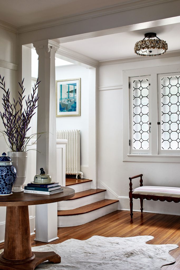
The front door opens into a predominantly white foyer with rich hardwood floors and accents of bold color. From there, however, the color starts to dominate in each room. “Moving in from the front door, we want it to feel light and bright, and then as you’re walking through the house, you’ll see these bits and pieces of the color, and it kind of draws you in,” Carlin says.
As the house has sectioned rooms rather than a wide-open contemporary floor plan, it was easy to give each room its own personality. However, Carlin also had to consider sightlines. Because you can glimpse one space while in another, there must be consistency in the design, a kind of harmonious drama that Carlin has achieved.
One major advantage she had was an abundance of natural light, which made it easier to work with all the bright colors and patterns. “Some homes, they can feel a bit darker,” she says. “But because this had great windows, it influenced what kind of color tones we could pick. I think the color kind of comes to life a bit more when it’s getting a nice spread of natural light.”
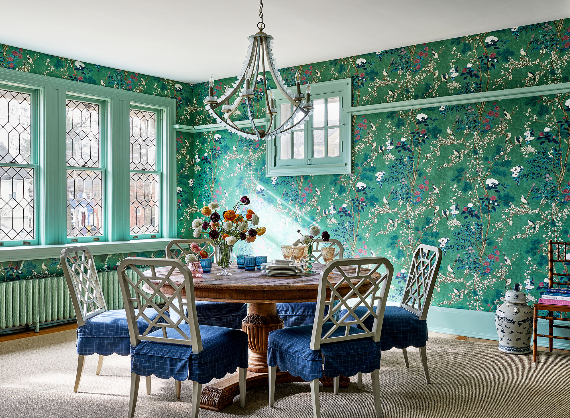
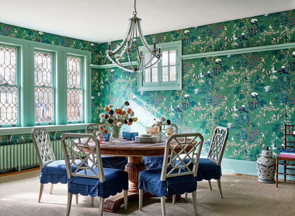
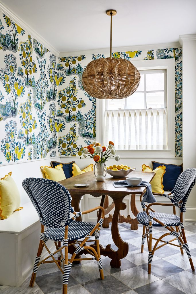
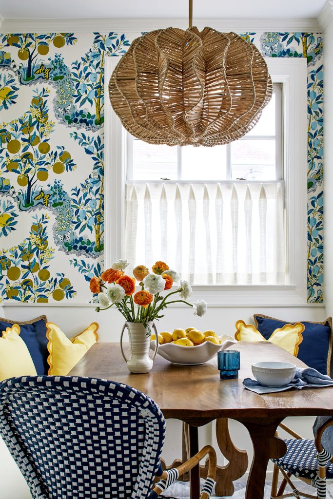
In the eat-in kitchen, a vivacious floral Schumacher wallpaper in the breakfast nook influenced other pops of color, such as the bold blue chairs and yellow throw pillows on the built-in bench. Even with such a busy pattern, the wallpaper still works well with the kitchen’s flooring, thanks to the contrast between the scales of the patterns. Carlin notes there’s a secret to avoiding a clash while pairing two patterns. In this case, combining one large floral pattern with a smaller geometric pattern adds sophistication and depth. Even two florals can work together, she says, as long as the scale of one pattern differs from the other.
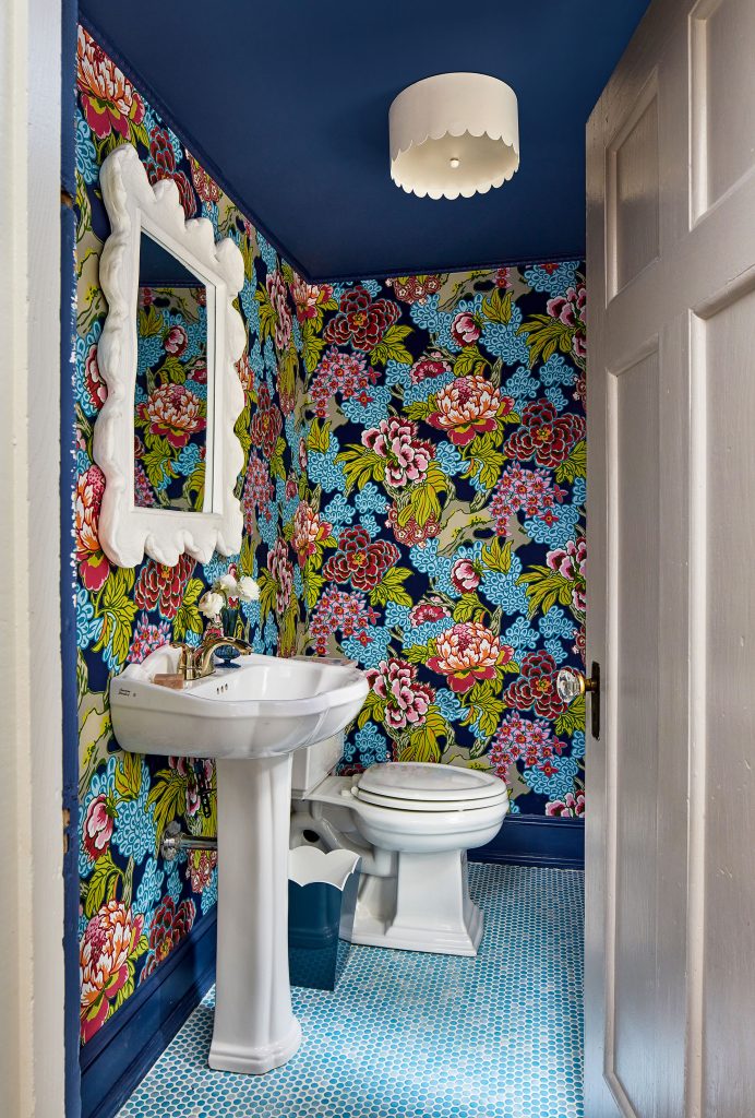
Another room where the wallpaper led the design is the powder room on the main floor. Carlin carried its bright color into the painted ceiling and trim work but balanced it out by keeping the sink and mirror frame white, which gives the room “a breath.” Round “penny” tiles on the floor add more color and interest.
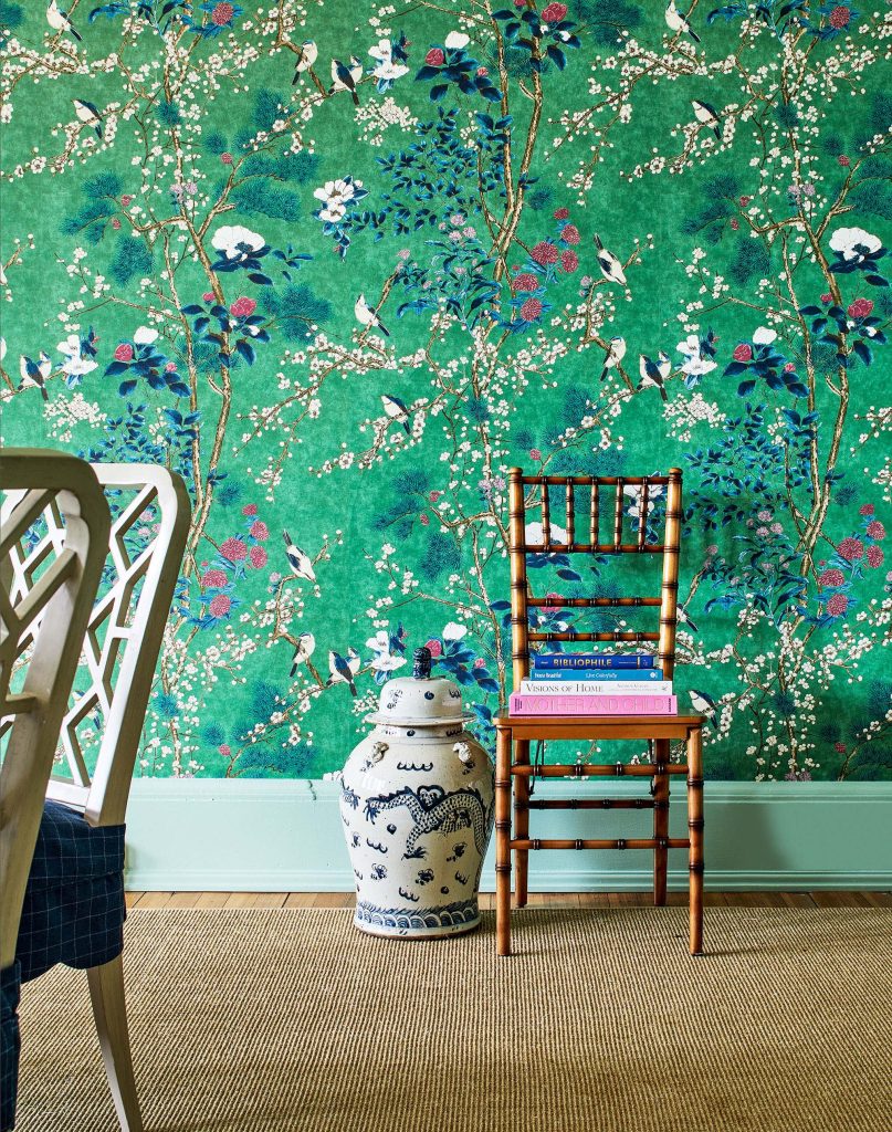
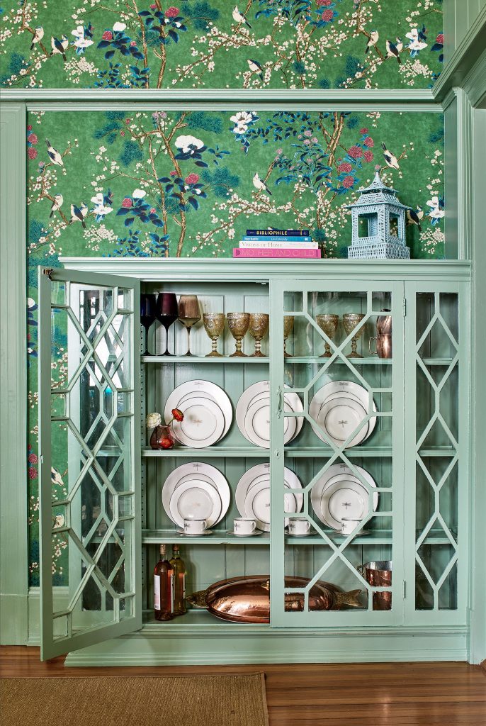
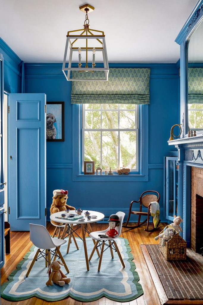
Bright blue dominates the children’s toy room, with the walls and trim painted the same color: a shade Carlin chose because it’s not navy, which can sometimes feel too predictable in Annapolitan homes. The monochromatism of all the blue is broken up by the Roman shades on the window and a statement light fixture. Touches of green tie the toy room in with the dining room, where lively floral wallpaper serves as the dominant statement. Blue seat covers add a pop of a different color while serving a practical purpose as well—they are durable, perfect for children.
When choosing materials, Carlin is particular. She considered the double rub of most fabrics, referring to the number of times a fabric can be rubbed back and forth before it starts pilling. This is frequently used as a way of measuring how resistant the fabric is to abrasion. A high double rub count means that these textiles can hold up to the wear and tear of frequent use.
Another durable textile in the dining room is the jute sisal rug that covers nearly the entire floor. This rug adds texture and balances out the bold color, but the jute sisal material will hold up well to foot traffic.
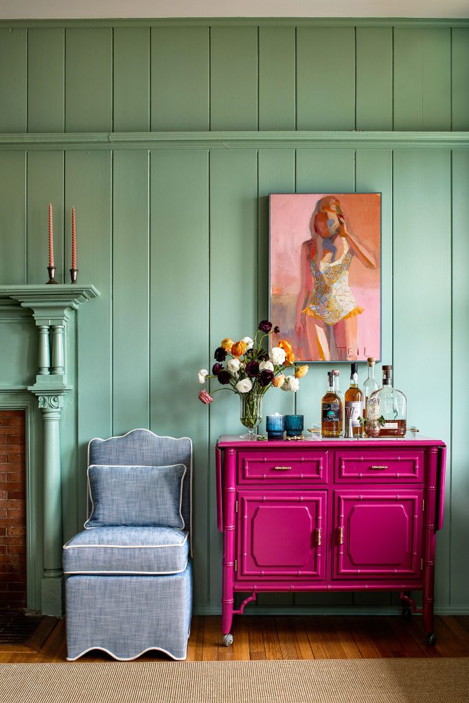
The home’s original elements in the room—wood wall paneling, a radiator, and a built-in shelf—received a coat of paint to re-enliven them. Carlin says she likes reimagining a home’s touches this way instead of removing them. “It depends on what it is, but I would say I generally like to work around it because I think there are just so many details that we don’t always have in new builds,” she says. “I like to keep them and see if there’s a way we can freshen it up, so to speak.”
Another example is the fireplace in the toy room, which was painted the same blue as the walls and trim. “I want to keep those details in as much as possible. I think by painting it that fun color, it just comes back to life.”
With its bright colors and eye-catching patterns, this house is certainly full of life. Each bold choice balances nicely with all the others, creating a cohesive aesthetic with surprises around every corner.

INTERIOR DESIGN: Katie Carlin Interiors, Annapolis, Maryland, katiecarlininteriors.com
ELECTRICAL: Chesapeake Electric
FLOORING (KITCHEN): Joe Saladino Tile
PAINTING: Grit & Ash (kitchen cabinets), Farrow & Ball
WINDOW TREATMENTS: Yardstick Interiors
PAINTING IN DINING ROOM: Teil Duncan
WALLPAPER INSTALLATION: Lonnie’s Lost Art
KITCHEN TABLE: Garfield Furniture
CHAIRS: Serena & Lily
WALLPAPER: Schumacher
DINING ROOM BAR: One of a Find (Charleston, SC)
DINING ROOM: Thibaut
POWDER ROOM WALLPAPER: Thibaut
CHAIR: oomph Home
TOY ROOM CHANDELIER: Visual Comfort
©Annapolis Home Magazine
Vol. 15, No. 3 2024