- © 2025 Annapolis Home Magazine
- All Rights Reserved
By Tom Levine | Photography by Marta Hansen
 When a Washington area couple Sandy and Bob Cohn decided to reside in Annapolis full time, they knew that their small, outdated weekend house on the South River was not going to serve them well. They wanted a home that spoke to their passions. Sandy is an avid cook, Bob an audiophile and lover of classical music, and they both have a taste for modern architecture. It was not surprising that they turned to Annapolis architect Marta Hansen to design their new house.
On college breaks, Hansen realized she wanted to become an architect after jogging by a house in her family’s neighborhood. The house was modern and she liked it so much that she tracked down the architect. Rather audaciously, she called his office and soon found herself receiving a bit of face-to-face career counseling from Hugh Newell Jacobsen, one of America’s great modern architects.
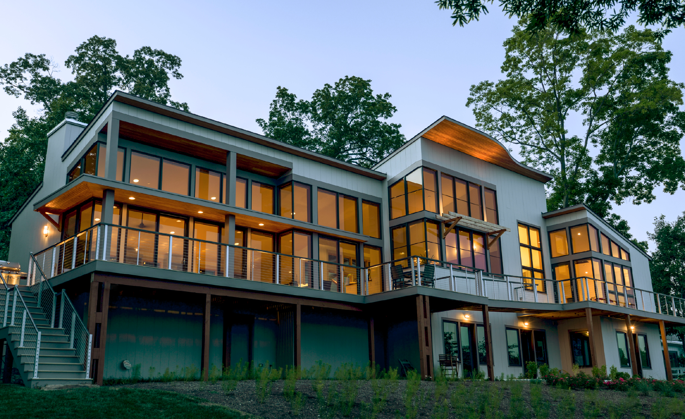
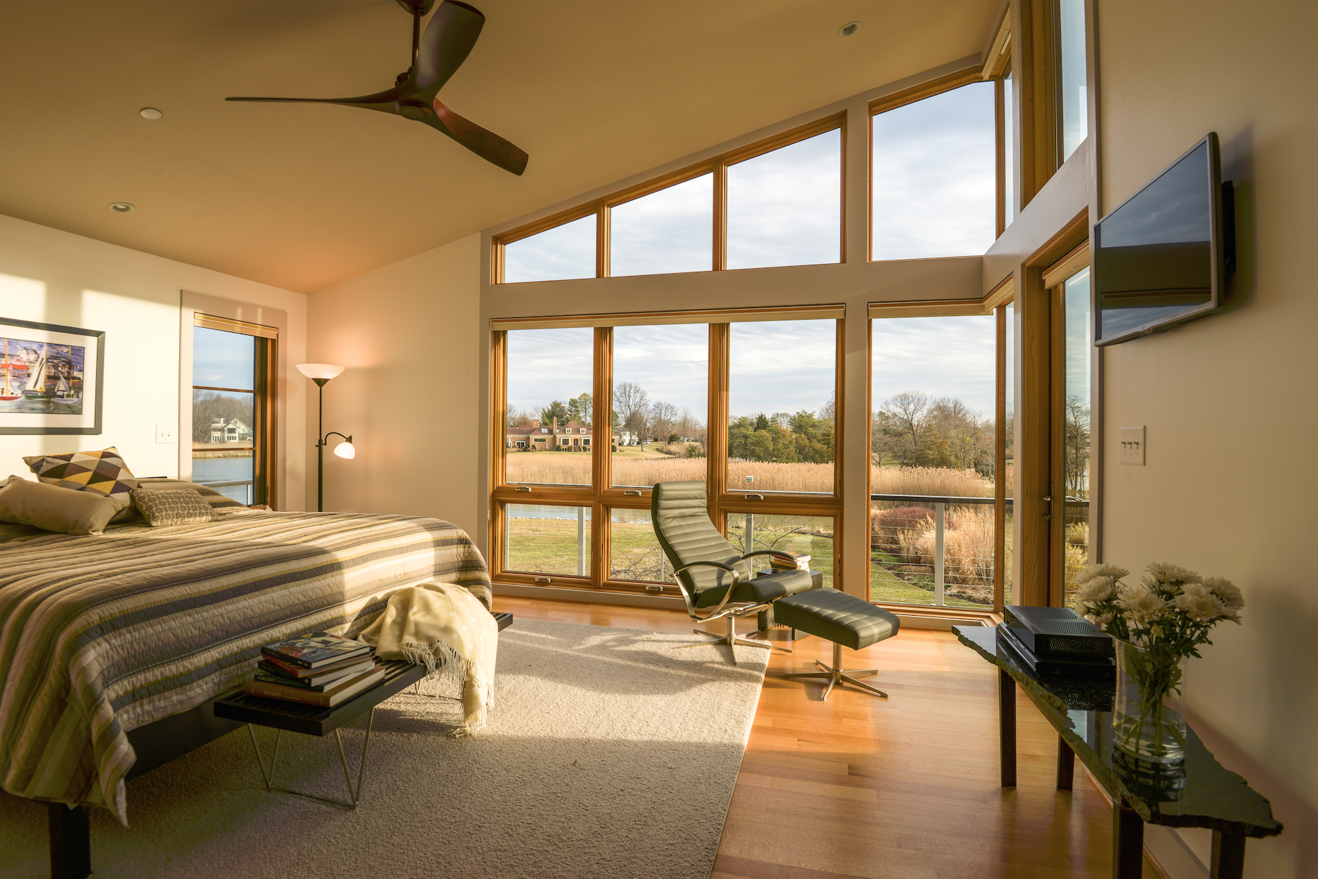 The house Hansen designed for the couple is modern in the best ways. It is straightforward and elegant, simple and unadorned, essentially two rectangles capped with shed roofs. It takes its cues from the drama and beauty of its setting. The house sits on a point where Lake Hillsmere empties into the South River. The lot boasts a great view, a swath of sea grass edging a small cove that opens to a long, wide visual of the river. The design never tries to upstage its environment.
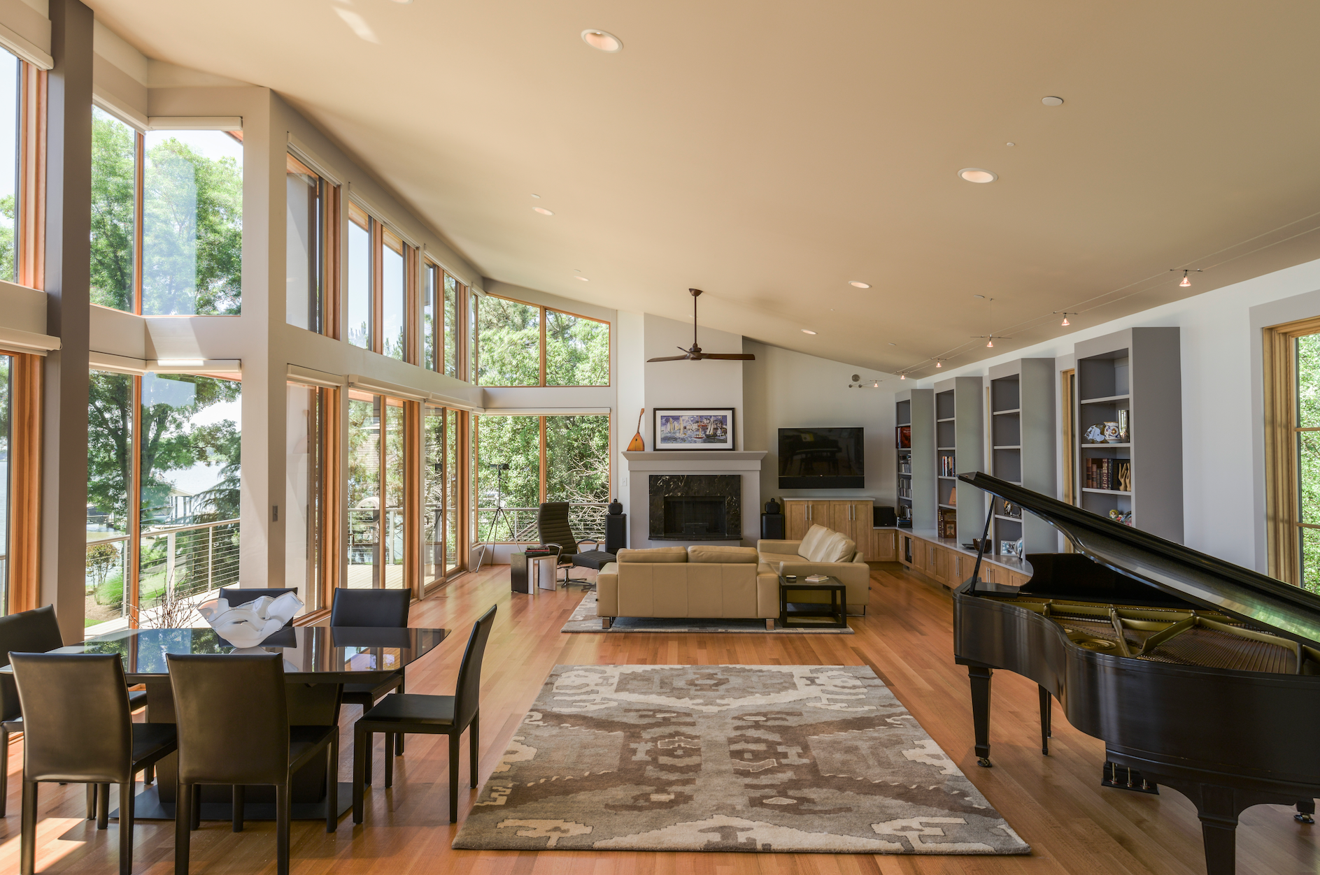
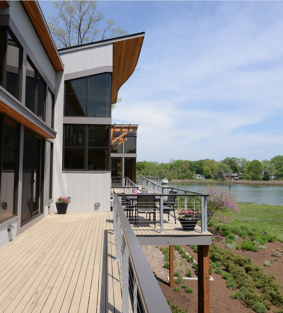 The eave on the center section of the roof provides a hint of the owners’ passion for music. It is cantilevered, jutting out and curving back, echoing the line of the piano in the living room, the slope of the shed roof further emphasizing the visual metaphor. In fact, Hansen says, “the inspiration for the house was Bob’s love of music.” She nourished that inspiration by listening to classical music while drafting the design. She visualized the design in musical terms. Elements that repeat themselves (the open corners created by butt jointed glass, the row of built-in bookcases separated by the negative space of vertical windows) are a leitmotif. An undulating glass brick wall separates the kitchen from the front door. Hansen says it visually “breaks the box,” the straight edged geometry of the structure, but she also hears it as a “melody in a structured piece of classical music.” The serpentine line also adds structural integrity to the wall. It would likely collapse under its own weight if it were straight.
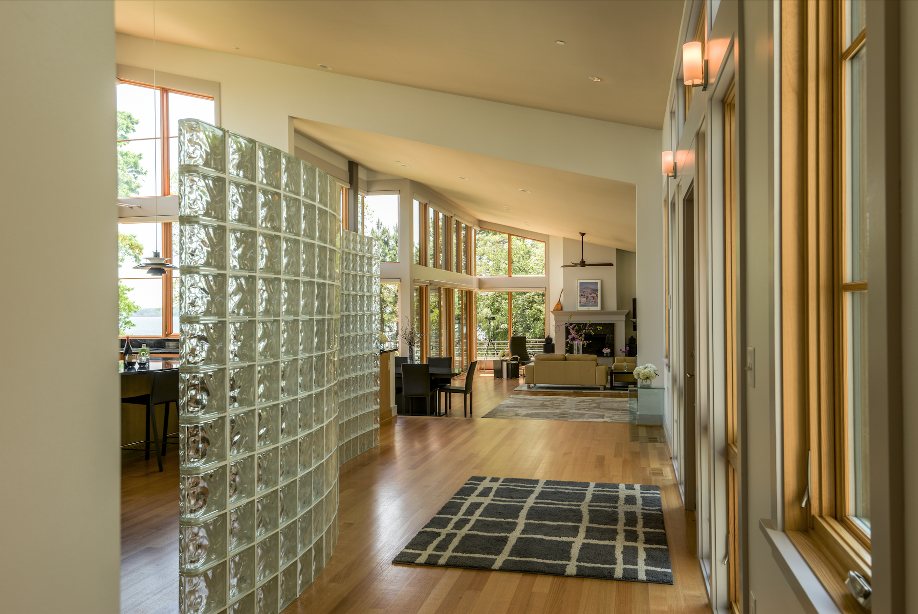 The glass bricks create a sense of drama for visitors entering the front door. You can see refracted light reflecting off the river, but you can’t see the river or the kitchen. The kitchen eschews stainless steel for a much cleaner look. Katherine Dashiell of Reico Kitchens in Annapolis understood that the homeowners “wanted the view to take precedence,” and her design reflects that in its clean modernism. Cabinet and drawer pulls provide the only hint of stainless steel. The refrigerator is faced in maple panels that match the cabinets. Glossy black marble counters, a smooth black cooktop, and an exhaust fan that disappears into the counter when not in use, keep the look uncluttered. A pair of rounded metal pendants designed in the 1950s by Danish designer Poul Henningsen adds curves and color to the room while not detracting from the view. For Sandy, who is an accomplished cook, the kitchen works not just as a place to craft meals but also to be inspired by the setting. With the long view across a broad stretch of the river, it is “the best place to watch the weather. Storms, rain, winds, and waves and snow.”
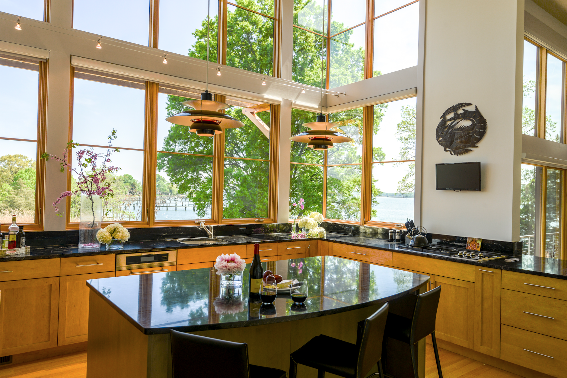 A great wall of glass, running the length of the room and soaring to the peak of the pitched ceiling, breaks down the separation between inside and out. Hansen explains that they used Loewen Windows on the waterfront side because they are made with Douglas Fir, which is stronger than the typical wood window made with Pine. “Because of the large window wall, we wanted this added strength so the wall would not flex in high winds,” she adds.
The soaring glass of the house’s back wall bumps out to give some separateness to the kitchen. The interior glass brick wall, besides separating the kitchen from the front door, provides a counterpoint to the kitchen’s flat planes and sharp lines. The kitchen is largely open to the living room, a space that was designed for music. Acoustics were an important design consideration. Hansen saw the room as an amphitheater, a place from which Bob can serenade his wife from the grand piano.
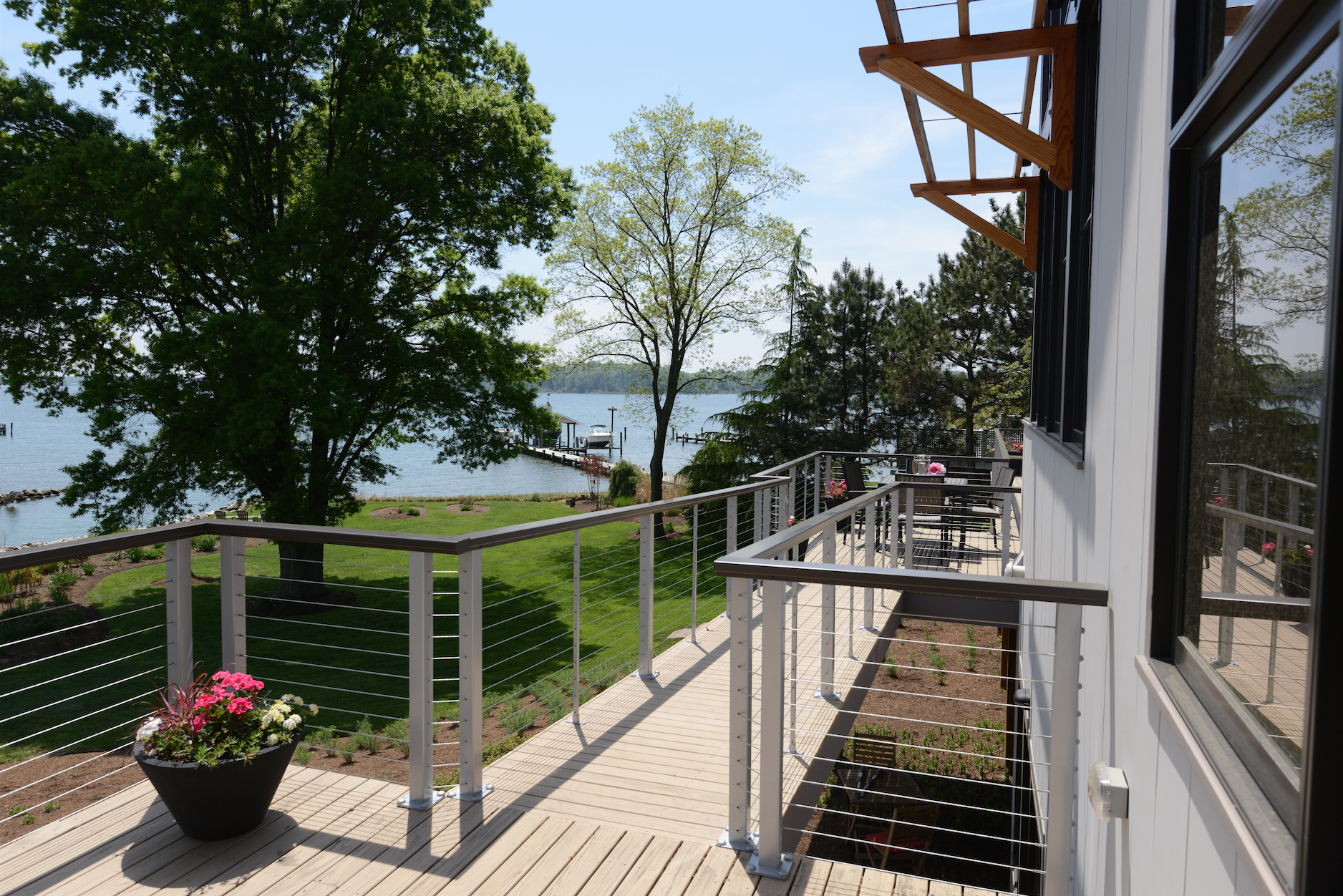 In a sense, the construction of a house is a bit like the creation of a piece of music. No matter how well it is composed by the architect, it will never work without an orchestra to “play” it. Lauer Construction of Annapolis, the general contractor, played this one beautifully. Because of their clean, simple, and unadorned lines, good modern houses leave little room for error. In kitchen designer Dashiell’s words, the Lauer team is “always trying to do it the best way possible. They go above and beyond.” With Hansen’s well composed symphony, they gave the couple a house that celebrates the majesty of nature (the drama of the sky, the movement of the water), the soaring beauty of music, and the pleasure of a clean modern form that never tries to outshine its setting.
Resources:
Architect: Marta Hansen, hansenarchitects.net
Builder: Lauer Construction, lauerhomes.com
Kitchen Designer: Katherine Dashiell, Reico Kitchens and Baths, reico.com
Windows: Loewen Window Center of Annapolis, loewenwindowsofmidatlantic.com
Landscaping: Good Earth Gardeners, goodearthgardeners.com,
and Severn Grove Ecological Design, severngrove.com
Tom Levine writes about architecture, design and culture.
A resident of Annapolis, he holds a bachelor’s degree in art
history from Boston University.
From Vol. 6, No. 4 2015
Annapolis Home Magazine