- © 2025 Annapolis Home Magazine
- All Rights Reserved
By Kymberly Taylor | Photography by Steve Buchanan

When a homeowner purchased a 1960s rancher on a large, wooded lot on Prospect Bay, she faced a dilemma. She loved the views, the deep-water pier, and the resident osprey, but she could barely glimpse the water from its musty three-season porch. Could there be a way to “dial up the cool and downplay the frump,” as one homeowner puts it? What were her options? When it comes to most ranch houses, there are usually two clear choices: to restore or tear down. This homeowner chose restoration.
However, when custom builder Greg Younger investigated the foundations, he found a crawl space filled with water and rotting timber. “The crawl space down below was a big challenge because it was super wet, and it had two or three layers of old crappy plywood from the 1960s. We had to pull all that out and get it dried out,” he recalls. The original plan? Not an option. “We were going to try to add on to them… but it was so bad and so hacked up, we just decided it would be easier to start over,” he reflects.
Stephanie Cook of Speight Studio Architects stepped in to conceive a flowing floorplan, adding 500 square feet and a second story to the original footprint. She calls the new style a ‘hybrid.’ “It is a confluence of different styles; there are some shingle roots because of the roofs and gables and how it all comes together. But basically, it grows from what was there, which was an iconic postwar American generic box.”
The box is no more. In its place is a 2800 square foot three-bedroom home with pitched roofs and very few walls on the first floor. The layout is so airy it seems like a perpetual breeze blows through it. How was this achieved? Key elements are modern light fixtures, high ceilings, and a disciplined neutral palette, including 10-ply engineered white oak floors. Dramatic 18-foot ceilings in the great room are spanned by custom-milled timbers by Guy Wheat, who also supplied the fireplace mantel composed of “a chunk of white oak” that is most likely reclaimed barnwood. Paint colors, hardware, tile, and furnishings are composed of whites, blue-greys, and tans, explains interior designer Elizabeth Horne.
“The homeowner did not want the usual ‘coastal cottage’ look,” says Horne. “She wanted something clean, flowing, and contemporary but welcoming. She wanted a place where her nieces could come over and ‘feel free to play and not worry about spilling water on the floor.’ ”
The contemporary floor plan encourages interaction. The great room and dining room flow into the kitchen and butler’s pantry, distinguished by soft white cabinets offset by grey-veined granite countertops. The kitchen was designed by Brad Kreer; Horne selected all the light fixtures, furnishings, and hardware. “The kitchen is a blend of traditional and modern elements. For the built-ins and cabinetry, we used a classic Shaker style door, but narrower” to make it a little more contemporary, she explains. The island countertop, adjacent to the wooden bespoke dining table, is composed of a natural stone that looks like sand.
Several almost invisible features throughout the home contribute to its distinctively modern aesthetic. One such feature is the cove molding—one of Younger’s specialties. The custom panels in the foyer and on the second-floor landing are another. Milled in his expansive workshop in Davidsonville, they are painted a warm white, accentuated by black trim, and free of hardware. Closets and hidden compartments spring open at the slightest touch.
This subtle aesthetic continues on the second floor. The primary bedroom, tucked between sloping rooflines, is distinguished by Younger’s signature white wall panels, many operated by touch. In the primary bath, large porcelain wall tiles minimize the appearance of grout lines. The master bath features large 3 x 4 ft. tiles, and the floor is Calcutta marble.
Because of these techniques and details, this home looks anything but busy. Set back from the water and framed by trees, it seems to fit right into its quiet neighborhood, even though it is brand new. This is the result of mindful design and carefully calculated proportions. “It is well scaled… We do a lot of talking people out of scaleless spaces, you know, ten ft. ceilings and 20 ft. rooms. You don’t need to feel tiny. You don’t need to feel tight. But there is a good scale for space and how we interact with it,” reflects Cook.
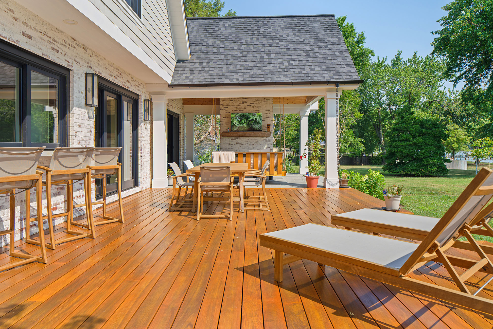
There is no doubt that comfort has been achieved. The homeowner is no longer trapped in a cramped “Florida Room.” Instead, she can gaze through sliding glass doors that open to a generous deck, flanked at one end by a massive fireplace with a covered roof and hanging swing, all crafted by Younger’s team. Banishing any vestiges of the plain rancher that once stood in its place, the deck, fireplace, and swing swaying in river breezes make this house a home. The frump is long gone, replaced, literally, by a cool breeze.
ARCHITECT:
Stephanie Cook, Speight Studio Architects, speightstudio.com
CUSTOM BUILDING:
Greg Younger, Younger Construction, youngerconstruction.com
INTERIOR DESIGN:
Elizabeth Horne Design, elizabethhornedesign.com
FURNISHINGS:
Kitchen Cabinets & Vanities – Pioneer Custom Cabinets
Kitchen Finishes – Farrow & Ball
Countertops – Atlas Stone Fabricators
Appliances – SubZero Wolf
Faucets – Rohl
Dining Room Light – Currey & Co.
Tile – Porcelanosa; Mosaic Home Interiors and Atlas Marble & Tile
Sofa – Benchmade Modern
Dining Table – Bespoke Design
© Annapolis Home Magazine
Vol. 14, No. 5 2023