- © 2025 Annapolis Home Magazine
- All Rights Reserved
By Dylan Roche
Photography by Peak Visuals

“From the beginning, the high-low contrast was very purposeful throughout the space.” – Melissa McLay
Intricately detailed molding. Brass hardware. Crystal light fixtures. These are just a few elements included in the design of this luxury penthouse condo located in historic Sykesville. The homeowners were eager to relocate from the city and find a quiet spot to live where they could retain the classic ambiance of their previous condo. What makes its classical interior especially distinct is the bold balance between dark and light. This balance prevents the home from ever feeling too heavy or overwhelming, especially in a condominium with space and storage limitations, explains Melissa McLay of Melissa McLay Interiors.
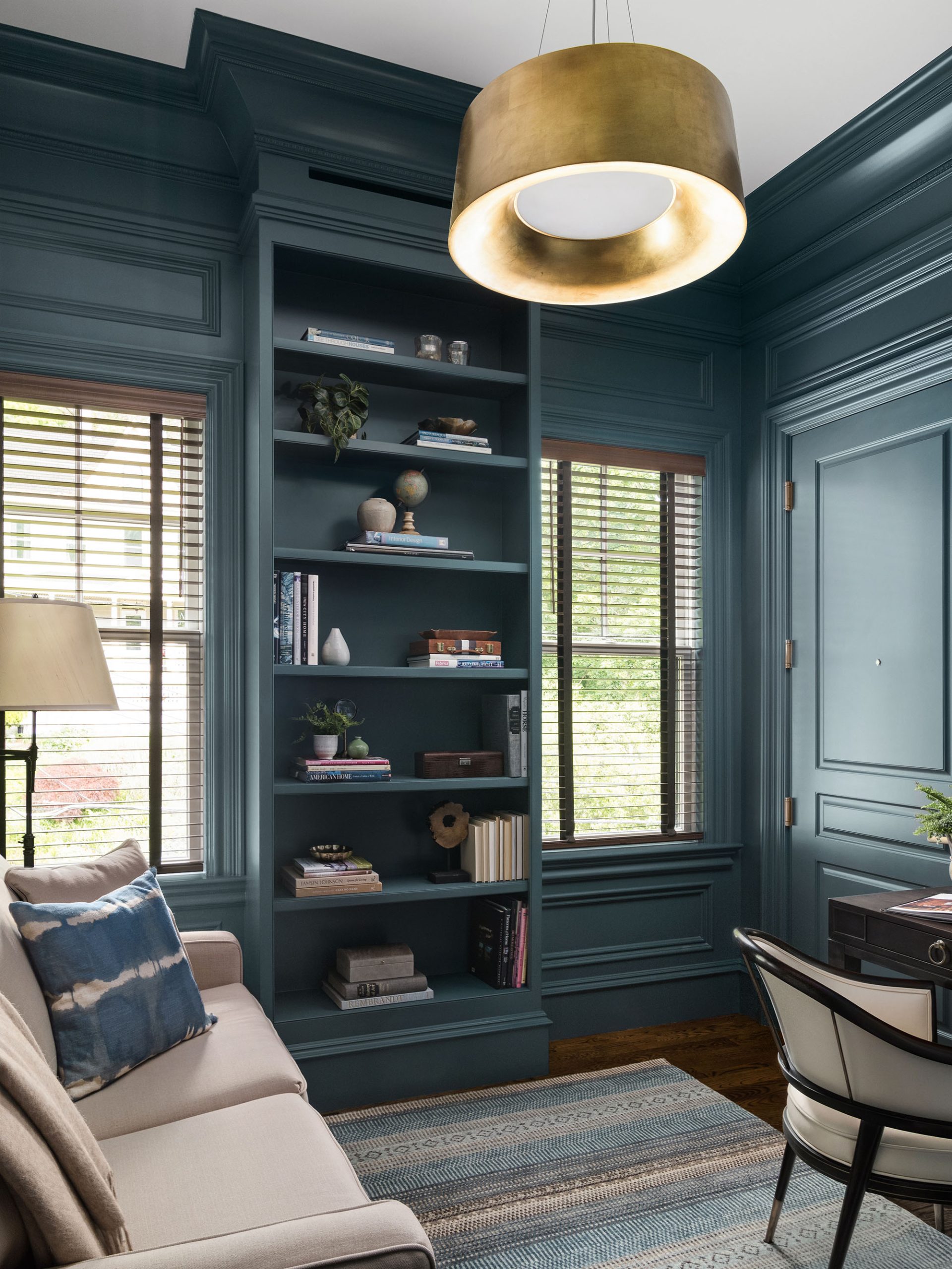
In many rooms, glossy black doors stand out against airy white walls. In the office, deep blue walls are lightened by a softer rug and sofa. “I love having that striking contrast between the two,” McLay says. “From the beginning, the high-low contrast was very purposeful throughout the space.” In the living room, walnut built-ins and a custom marble fireplace provide a focal point that McLay describes as “elegant while still being masculine.” Walnut and marble, along with the dark gray raw silk draperies, are offset by the softness of the velvet armchairs and the cream-colored chenille loveseat.
To achieve the homeowners’ vision, McLay collaborated with Paul Mueller Jr. of Mueller Homes. She and Mueller had the advantage of working with a clean slate. Mueller took the time-honored elements of their old home and elevated them. “We wanted to keep to the style of the client, emulating what they had and bringing it up to today’s modern times,” he says.
This included creating custom trim, molding, and cabinetry—subtle yet powerful design elements in any home, great or small. They communicate visually to express a home’s era, personality, and aesthetic. In modern homes, molding and trim are purposefully minimal and may not exist at all. In traditional homes, the opposite is true. Often, you’ll find crown moldings, coffer ceilings, and corbels. In this home, custom millwork helps create a sense of tradition and timelessness, explains Mueller. Molding provided by White River and cabinetry by Charles Henry Fine Woodworking elevate the atmosphere of every room. “The molding details that were used throughout this space—you just don’t see them a lot anymore,” McLay says. For example, one sees bead molding, fluting, lamb’s tongue, egg-and-dart, running leaf, floral rosettes, and others.
Other elements that add sophistication are the marble backsplash in the kitchen, whose flashes of gold hues reappear and run the length of dark quartz countertops, and a glistening crystal chandelier that hangs over the table.
Much of the millwork serves a practical purpose, such as the arched China cabinet, built beside a hidden door that provides valuable storage space necessary in a 2,000-square-foot condo. The bar makes a statement with its dark wood and marble. Glass cabinets showcase crystal drinkware.
Creating a build like this, with such a level of detail in a smaller-than-usual space, called for a lot of planning on the part of Mueller and his team. “With our other projects, we work in fairly large houses and spaces, so this was a challenge for us,” he said. For example, they had to move large pieces into the space—such as the living room’s built-in shelves and fireplace casing and the china cabinet—without piecemealing them into smaller parts to be assembled later, which would have resulted in lower quality and presentation.
That careful planning indeed paid off. This condo embodies the luxury its homeowners sought without being predictable or boring. The skillful juxtaposition of light and dark colors and materials combine to create an interior that is not only beautiful but seems to defy the space limits that a condo might impose. McLay’s powerful yet simple design concept—the manipulation of light and dark—can make a small space feel larger and even quietly grand, affecting us physically as well as psychologically.
INTERIOR DESIGNER: Melissa McLay, Melissa McLay Interiors, Annapolis, Maryland. BUILDER: Mueller Homes, Sykesville and Annapolis, Maryland. ARCHITECTURAL MILLWORK: Charles Henry Fine Woodworking
© Annapolis Home Magazine
Vol. 15, No. 6 2024