- © 2025 Annapolis Home Magazine
- All Rights Reserved

Stepping inside this well-appointed home at 99 Compromise Street Condominiums, one can easily forget that it was once part of a gymnasium.
The Annapolis Rec Center, originally built in 1942 as a USO building, stood empty for several years until its most recent transformation into seven luxury condominiums by the Annapolis architectural firm, Hammond Wilson. The firm was able to retain the structure’s existing exterior walls, in keeping with the goals of historic preservation.
“Even though adaptive reuse work always has challenges, the structure of the building was sound,” said Leo Wilson, principal at Hammond Wilson. He added that the only major changes to the original building involved expanding a few windows, adding dormers to the roof (creating a third level within), and adding balconies to the front and rear of the building. “Since it was a former gym, the second and third levels were all open, making it easier to plan out the spaces while preserving the historical elements,” said Wilson. The firm created seven unique interior plans so that most of the units could enjoy water views, whether of the harbor, the Bay Bridge, or across Spa Creek.
The city setting is exactly what tempted the owners to purchase this two-bedroom, two-and-a-half bath condo as their second residence. To bring their vision of an ideal Annapolis condo to life, they hired designer Wesley Pehlke of Simply Wesley to lead the charge.
The homeowner’s requests were modest: create a relaxing space suitable for large family gatherings, emphasizing durability and functionality, while keeping a light, airy, coastal vibe.
Pehlke started right to work, incorporating her signature twists along the way, which include striking dashes of color and unusual finishes. She not only helped with all of the builder selections, but also incorporated interesting architectural elements—adding built-ins, shiplap, and other distinct touches to create the cohesive coastal look throughout.
“It’s the architectural elements, the functional furniture layout, and the beautiful details that make it all work,” said Pehlke.
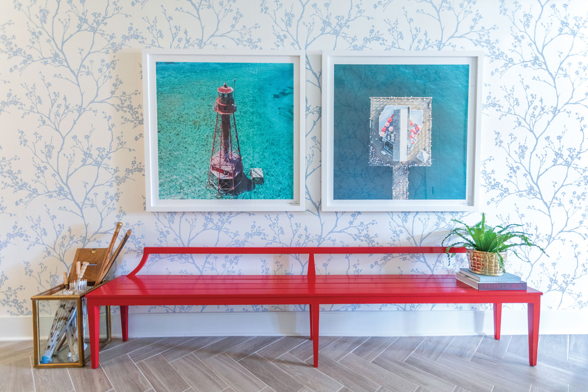
Pehlke slightly modified the architectural design by removing a doorway to create the foyer space. The expanse of the foyer led her to arrange the wood-look porcelain tile floors in a herringbone pattern, enhance the walls with grasscloth wallpaper, and add interesting light fixtures to draw the eye into the main living area. She even designed a vibrant red, 10-foot-long bench to serve as the entranceway’s focal point; its extended lines also guide the eye forward.
In the main living area, the porcelain tile is arranged traditionally and continues throughout the condo, softened here and there by area rugs.
A challenge for Pehlke was creating a combined dining and living space to maximize seating in a relatively small space. Her solution was to incorporate a round table in the dining room that seats eight and to use furniture that could perform double duty. For example, the buffet doubles as a console for the adjacent living room. “It was a nice way to marry the two rooms,” said Pehlke.
The space flows seamlessly from the dining area to the kitchen and the main gathering area where family can play games or watch TV. Anchoring the space is a large, comfortable gray sectional peppered with colorful throw pillows.
Pehlke customized the kitchen design by including a wide-edge quartz countertop and a bar sink. She also made modifications to the cabinets, adding glass and enhancing the upper cabinets with a nickel wire mesh to break up the white. The basket-weave tile backsplash affords a touch of warmth, picking up the nickel color of the cabinets above.
Off of the main living area, the doors open to the terrace, which spans the front of the building, providing a shady respite and a front-row view of the city. Pehlke assured plenty of seating with a long wood dining table that seats eight and another seating area with room for more to gather.
Back inside, a guest and a master bedroom are situated behind the main living area, each with its own personality, while retaining a coastal elegance.
The condo, like Annapolis, has a historical backdrop with layers of intriguing twists and turns. The neutral window shades, furniture, and walls are punctuated with artwork and nautical reds and blues, all seeming to express, “Welcome to Annapolis.” After all, Annapolis is certainly a colorful town, true to tradition, yet filled with culture and unexpected beauty.
ARCHITECT: Hammond Wilson, hammondwilson.com, Annapolis, Maryland | INTERIOR DESIGN: Wesley Pehlke, Simply Wesley, simplywesley.com, Annapolis, Maryland | BENCH: Design by Simply Wesley, constructed by Monkton Studios, monktonstudios.com, Monkton, Maryland | WALLPAPER: Schumacher’s “twiggy” grasscloth, fschumacher.com, installed by Bill Armiger | BATHROOM & KITCHEN BACKSPLASH TILE: Walker Zanger, walkerzanger.com | ART INSTALLATIONS: Chris Hansard | GARDEN PLANTERS: Annabelle Sailer Garden Design, Annapolis, Maryland
Annapolis Home Magazine
Vol. 10, No. 5 2019