- © 2024 Annapolis Home Magazine
- All Rights Reserved

 Just as the seasons have rhythms, so do our homes. In an earlier incarnation, this residence was a tiny split-level, but its beat was rock-n-roll. Rock legend Dave Grohl purchased the property in the late 1990s, building a makeshift recording studio in the basement that would rocket his then-new band, Foo Fighters, to Grammy Award-winning fame. Before long, band members Taylor Hawkins and Nate Mendel moved in, and the trio turned the basement into Studio 606, soundproofing the walls with sleeping bags.
It was here that they recorded “Nothing Left to Lose,” which won a Grammy for Best Rock Album. In fact, the album cover was shot on the front deck. Eleven more Grammys would follow. In an interview with author Glen Himes, Grohl said, “It was one of the most relaxing times of my whole life. All we did was eat chili, drink beer and whiskey, and record whenever we felt like it. When I listen to that record, it totally brings me back to that basement. I remember how it smelled and how it was in the spring: the windows were open, and we’d do vocals until you could hear the birds through the microphone. And more than any other record I’ve ever done, that album does that to me.
“When we won for best rock album, which we made in that basement, I was so proud—because we made it in my basement in a crappy makeshift studio that we put together ourselves. I stood there looking out at everybody in tuxedos and diamonds and fur coats, and I thought we were probably the only band that won a Grammy for an album made for free in a basement that year.”
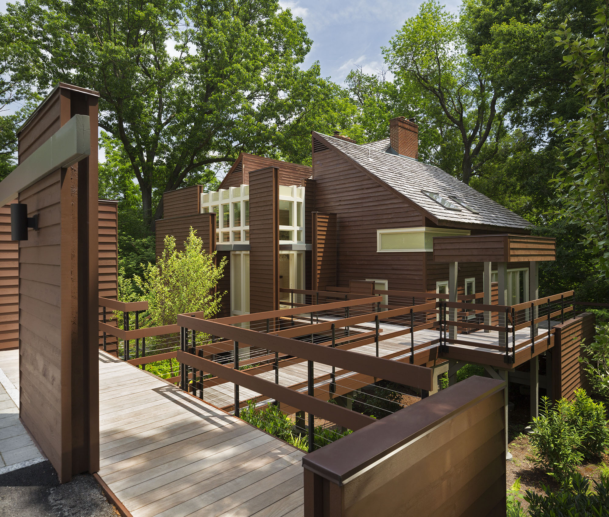
Though Grohl has moved back to Los Angeles, music remains in the air. New rhythms meet the old in a radical remodel by architect Donald Lococo, who expanded the home by one-third and added walls of glass along the home’s exterior.
Lococo, a trained classical pianist, notes that every musical piece has an underlying structure—rhythm, departure, return, modulation. And this is one way to understand this multi-level home. “The way the walls pull away from the home is one rhythm,” says Lococo. He points out the strong vertical rhythms created by yellow mullions on the exterior windows and notes that these are modulated in the foyer.
Connecting the living room and kitchen is a narrow mahogany band “that loops them together,” explains Lococo. “Also, there is the rhythm of the circular deck rail wrapping the house.” A visual music is found in the percussion of pitched rooflines and outside walkways, and short bridges lead here and there like riffs.
There is another way to understand its design. Lococo compares the home to a walnut with a hard shell that, when cracked in half, reveals individual pieces: “a furnished, beautiful core. There is the idea that the walls are the shell, that parts of the home are pulling away from itself,” he explains.
A husked walnut is an unusual image but a relevant analogy. With its exterior siding stained a deep chocolate brown—an homage to its original color—the natural world seems to embrace this home. Pine thickets and towering oaks shelter squirrels and birds. One can sense their terrestrial rhythms from the new living spaces, redesigned to take advantage of the forest’s ever-changing beauty, says interior designer Kelly Schuler of Madigan Schuler, who collaborated with Lococo and the homeowners early in the project. Commenting that the interior was “as dark as despair,” she added that Grohl was happy in the woods recording with his band. “They said that they were like squirrels running in and out of the house.” There seemed to be a free-flowing wildness, a coexistence between the artists and nature. “Woodpeckers regularly drilled into the house. When we got here, there were lots of patches,” she recalls.
Today, ambient light floats in through window walls as if a gift from the forest. The interior is alive with organic forms, natural materials, and art. Surrounded by a lush native landscape by Campion Hruby Landscape Architects, the interior appointments are uncomplicated. With soft grass wallpaper, recycled wool rugs, cowhide, and sectional, nothing startles or overwhelms. The live-edge coffee table is scaled low to better foreground exterior views.
“The homeowner did not want modern or cold on the inside. A mom with kids and dogs, she wanted a warm, comfortable home with a mudroom and a kitchen to walk down to,” says Schuler. In contrast to the home’s sharp planes and angles, she did not want anything inside that had a hard edge. Schuler points out a “bird’s nest” chandelier in the breakfast nook that came from Australia and giant fossil sculptures in the living room and outdoor decks. “We wanted the walls to kind of go away and let the view take over,” she says.
The interior is soft and comfortable, but Lococo made sure to preserve Studio 606 in spirit. The home has an alertness as if a fire has just been lit inside; a bold project could be underway. The home cannot be seen in its entirety from any one vantage point. However, Lococo notes invisible connections in the floor plan. The mudroom behind the foyer conveniently steps down into the kitchen, which, in an unusual move, is hidden from the front door. “It is not modern and open-spaced, but something more,” he reflects. “I call it cozy modern. The open spaces are balanced by private ones.”
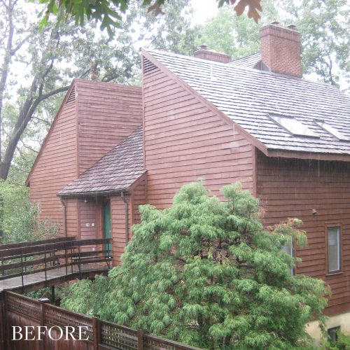
Lococo reflects on the original structure, so plain that it seemed to recede into the woods. “It had a Brutalist kind of look,” he says. The architecture of the Brutalist era grew out of the modernism of the 1950s and 1960s. It was purposely uniform, without individuality. “The idea was that each building was for the good of the masses, that everyone is in a rhythm…. There is not one spirit, one heart.” His clients gave him the following challenge: “They wanted me to put a face on the faceless and add scale and perspective. The redesign blew it open.”
Maybe that is what captures our interest: not just this home’s mesmerizing face but its hidden depths. “There is the warmth underneath the faceless Brutalist piece, a level of soul on the inside,” he notes. This dialectic is perhaps what Lococo was trying to mirror through structure and form, experimenting with solid walls that are both shelter and barrier. In building and removing them, there is a crucial “breaking through” and a revelation of its inaudible rhythms.
EXTERIOR AND INTERIOR ARCHITECTURE: Donald Lococo Architects, donaldlococoarchitects.com, Washington D.C. | INTERIOR DESIGNER: Madigan Schuler, madiganschuler.com, Alexandria, Virginia | KITCHEN CABINET DESIGNER: Lobkovitch Kitchens, lobkovich.com, Tysons, Virginia | LANDSCAPE ARCHITECT: Campion Hruby Landscape Architects, campionhruby.com, Annapolis, Maryland
© Annapolis Home Magazine
Vol. 13, No. 2 2022